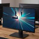

For most gaming monitors, set brightness for your room (not the highest level), keep contrast near its default unless dark detail is crushed, leave gamma around 2.2 for a standard look, and keep sharpness at its neutral value. These four controls shape how every game looks, and small changes in the wrong direction can hide enemies in shadows, blow out bright scenes, or add ugly halos around edges.
Picture menus differ by brand and model, and labels such as black level, shadow boost, or dynamic contrast vary, so check your monitor’s manual for the exact names. This guide explains what each setting does, how to adjust it without special equipment, and which extras are worth leaving alone. Always change one control at a time and use a game scene or test image you know well.
Start With the Basics Before You Touch Anything
Picture quality depends on the whole chain, not only the on-screen menu. A few quick checks prevent confusion later.
Run native resolution and refresh rate
Confirm Windows is using the monitor’s native resolution and highest refresh rate. Scaled resolutions make sharpness look wrong no matter what you set.
Choose the right picture mode
Many monitors offer presets such as standard, FPS, RTS, or movie. Presets often change several values at once, including color, contrast, and sharpening. Start with the standard or most neutral mode so you know what you are adjusting.
Let the monitor warm up and control the room
Allow a few minutes for the panel to stabilize, then adjust in the lighting you normally play in. A bright window behind the screen or a lamp reflecting on it makes any setting look different.
Brightness
On most monitors, the brightness control adjusts the backlight, which sets how bright the whole screen is. It does not always change the black level, so do not treat it as the way to see into dark corners.
How to set it
Display a white web page or a document and compare it to a sheet of white paper in the same room. The screen should look similar, not like a lamp pointed at your face. In a bright room, higher brightness is reasonable; in a dark room, a lower level reduces eye strain and improves perceived contrast.
Common pitfalls
Setting brightness to maximum for all situations is a common habit. It tires the eyes and can wash out blacks on some panel types. If HDR is on, brightness may behave differently, so see your monitor and operating system documentation.
Contrast
Contrast sets the difference between the brightest and darkest parts of the image. Raise it too far and bright details clip to pure white; lower it too far and the image looks flat.
How to set it
Use a test image with many shades of white or light gray, which you can find from reputable monitor review sites. Raise contrast until you start losing separation between the lightest steps, then step back slightly. If the default is already balanced, leave it.
Dynamic contrast and similar features
Some monitors include automatic contrast or dynamic backlight modes. These can change brightness on the fly and cause inconsistent shadows in games, so many players turn them off for stable visuals.
Gamma
Gamma controls how mid-tones are shaped between black and white. Lower gamma values brighten mid-tones and shadows, while higher values make the picture deeper and darker. A value near 2.2 is the common standard for PC content and games.
When to adjust
If dark scenes look murky and details disappear, try a slightly lower gamma setting. If the image looks washed out and flat, a higher setting may help. Make small changes, since gamma affects every scene.
Gamma versus in-game brightness
Many games have their own brightness or gamma calibration screen, often asking you to make a logo barely visible. Set the monitor first, then use the in-game slider for fine adjustment. Avoid pushing both to extremes.
Sharpness
Sharpness adds an artificial edge enhancement, not real detail. At a neutral value, a monitor shows the image as the source provides it. Pushing sharpness higher creates bright outlines around objects and can make text look rough.
How to set it
Look at fine text and the edges of icons. If you see halos or crunchy outlines, lower the setting. If the monitor labels a middle value as default, start there. Some panels look soft at a neutral setting because of their scaling, and a small increase can help, but avoid large changes.
Resolution scaling matters more
If a game runs below native resolution, the scaler blurs the image. Adjusting sharpness cannot fix that. Using native resolution with an upscaler in the game is generally a better route.
Quick Reference Table
| Setting | What it does | Good starting point | Warning sign |
|---|---|---|---|
| Brightness | Backlight level | Matches room light | Eye strain, washed-out blacks |
| Contrast | Light to dark range | Default or slightly adjusted | White details clipping |
| Gamma | Mid-tone curve | Around 2.2 | Murky shadows or flat image |
| Sharpness | Edge enhancement | Neutral or default | Halos around edges |
| Color temperature | White point warmth | Standard or around 6500K | Yellow or blue tint |
| Overdrive | Pixel response | Medium | Ghost trails or inverse ghosting |
Other Settings Worth Knowing
Several related controls can change the look of your games, and some of them are easy to misuse.
- Black level or shadow boost: Lifts dark areas to reveal detail. Useful in dark games, but too much makes the picture look gray.
- Overdrive: Speeds up pixel transitions. A medium setting often balances blur and artifacts, but check your monitor’s documentation.
- Motion blur reduction: Strobing modes can reduce blur but often limit brightness or refresh rate options.
- Color mode (sRGB, wide gamut): Wide gamut panels can look oversaturated with standard content unless an sRGB mode is selected.
- HDR: Behaves differently from SDR controls. Follow your operating system and monitor guidance.
Adjusting for Different Types of Games
One setup rarely suits every title. Competitive shooters, dark horror games, and bright colorful adventures place different demands on the screen, so it helps to think about which compromises you are willing to make.
Fast competitive games
Visibility and low latency come first. Keep sharpness neutral, avoid heavy processing modes, and use a small shadow lift only if dark corners hide targets. Make sure features that add processing delay, such as heavy image enhancement, are off.
Atmospheric and horror games
These rely on deep shadows and a controlled mood. Avoid boosting black level so far that the darkness looks gray, and use the game’s own calibration screen to set the final brightness. A slightly darker room helps these titles feel right.
Bright and colorful games
Watch contrast so skies and highlights keep their detail. If colors look oversaturated on a wide gamut panel, try a standard or sRGB color mode, if your monitor has one.
Saving a few named profiles in the monitor menu, when supported, lets you switch quickly instead of retuning each time.
A Simple Adjustment Routine
- Reset the monitor to factory defaults and select the standard picture mode.
- Set native resolution and refresh rate in the operating system.
- Adjust brightness to your room using a white page.
- Check contrast with a gradient or test image and avoid clipping.
- Tune gamma around 2.2 and adjust only if shadows look wrong.
- Lower sharpness if you see halos, then review text and game scenes.
- Note your final values so you can restore them later.
Before You Finalize Your Settings
- Preset modes and dynamic features are off or understood.
- Room lighting is the same as when you normally play.
- You checked both bright and dark game scenes.
- You wrote down the values for future reference.
Common Mistakes
- Using the brightest setting at all times and straining your eyes.
- Raising sharpness to make a blurry picture look crisp, adding halos instead of detail.
- Stacking monitor gamma boosts and in-game brightness boosts until shadows look gray.
- Leaving dynamic contrast on and wondering why dark scenes keep shifting.
- Choosing a competitive preset that oversaturates colors for every kind of content.
Related guides
- Aio Liquid Coolers For High Performance Gaming
- How To Lower Input Delay In Competitive Shooters
- Wireless Gaming Headsets Under 100 For Pc
Frequently Asked Questions
What gamma should a gaming monitor use?
A value near 2.2 is the usual target for PC content. Adjust slightly only if shadows or mid-tones look wrong in your games. Check the manual for how your monitor labels its gamma options.
Should I turn up shadow boost for competitive games?
It can help reveal enemies in dark areas, but too much reduces contrast and makes the image gray. Use a small amount and check it in a map you know. Leave it off for games with moody lighting where atmosphere matters.
Is a higher sharpness setting better?
Not usually, since it adds edge enhancement rather than real detail. A neutral value generally looks cleaner. Raise it only slightly if the image looks soft.
Do I need a calibration device?
Not for a good result in games. Adjusting by eye with test images works well for most players. A calibration device is useful if you also edit photos or video, but it is optional for gaming.